
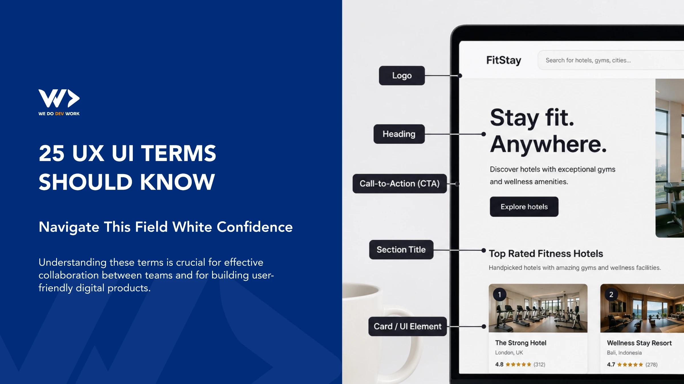
UX/UI vocabulary is easier when you can scan it. Below are 28 terms grouped by what they are used for. Each one has a short definition and a line on why it matters to your business. It is the shared language of designers, developers and the people who pay for the product. For the bigger picture, read why UX/UI design should be part of a business strategy and how I approach UX projects, from chaos to direction.
Updated October 2026: added WCAG 2.2, Core Web Vitals and dark patterns; tightened the original definitions.
- Foundations: User Experience (UX), User Interface (UI), Accessibility, WCAG 2.2, Responsive Design, Core Web Vitals
- Research and planning: Persona, Journey Map, User Flow, Information Architecture (IA), Usability Testing, A/B Testing
- Design and structure: Wireframe, Prototype, Mood Board, Typography, Visual Hierarchy, Gestalt Principles, Flat Design, Components, Design System
- Interaction and conversion: Call-to-Action (CTA), Microinteractions, Progressive Disclosure, Onboarding, Empty State, Contextual Help, Dark Patterns
Foundations
1. User Experience (UX)
The overall experience a person has with your product or service, from first visit to support. Good UX makes tasks intuitive and quick.
Why it matters: Poor UX shows up as abandoned carts, support tickets and churn. It is a business metric as much as a design one. See why UX/UI belongs in your business strategy.
2. User Interface (UI)
The visible and interactive layer: buttons, icons, type, colour and layout. UI is part of UX, not a synonym for it.
Why it matters: Users judge credibility in seconds, and the UI is what they judge. A clean UI lowers perceived risk.
3. Accessibility
Designing so people with visual, auditory, motor or cognitive impairments can use the product, including with screen readers and keyboards.
Why it matters: It widens your audience, reduces legal exposure and usually improves SEO and usability for everyone.
4. WCAG 2.2
The Web Content Accessibility Guidelines, the W3C standard most accessibility laws and audits point to. Version 2.2 became a W3C Recommendation in October 2023 (the current edition is dated 12 December 2024) and is backwards compatible with 2.1. It adds nine success criteria, including Target Size (Minimum, AA: pointer targets of at least 24 by 24 CSS pixels), Dragging Movements, Consistent Help, Redundant Entry and Accessible Authentication. It removes 4.1.1 Parsing. Level AA is the usual target; for normal text that includes a 4.5:1 contrast ratio. W3C, what is new in 2.2.
Why it matters: Ask your agency for "WCAG 2.2 AA" in the brief. It gives you a testable target instead of a vague promise.
5. Responsive Design
Layouts that adapt to any screen size, from phones to wide desktops, with one codebase.
Why it matters: Most visits to many sites come from phones. A layout that breaks on mobile loses those visitors and hurts search visibility.
6. Core Web Vitals
Google's three measures of real-world page experience: Largest Contentful Paint (loading, good at 2.5 s or less), Interaction to Next Paint (responsiveness, 200 ms or less) and Cumulative Layout Shift (visual stability, 0.1 or less), assessed at the 75th percentile of page loads. INP replaced First Input Delay as a stable Core Web Vital in 2024. web.dev.
Why it matters: Slow or jumpy pages feel like bad UX and can cost rankings. Test your site free with EngineeringScore, and see SEO for developers for the technical side.
Research and planning
7. Persona
A fictional but research-based profile of a target user, used to keep decisions grounded in real goals and constraints.
Why it matters: Personas end "I like it" debates. Only useful if built from real interviews or data, not guesses.
8. Journey Map
A visual of the end-to-end steps, feelings and pain points a user goes through with your product or service, including offline steps.
Why it matters: It shows where customers drop off, so you fix the costliest gap first.
9. User Flow
A diagram of the steps a user takes to complete one task, such as checkout or sign-up, including decision points.
Why it matters: Every extra step costs conversions. Flows expose unnecessary ones before anything is built.
10. Information Architecture (IA)
How content is organised, grouped and labelled so people can find things. Navigation, menus and page hierarchy are all IA.
Why it matters: If users cannot find it, it does not exist. IA also shapes how search engines understand your site.
11. Usability Testing
Watching real users attempt real tasks with your product and noting where they struggle. Five users per round already surface many major issues.
Why it matters: It is the cheapest way to find problems, before they are expensive to rebuild.
12. A/B Testing
Showing two versions of a page or feature to different visitors and comparing a single measurable outcome.
Why it matters: It replaces opinion with evidence, but needs enough traffic to reach a reliable result. Small sites are better served by usability testing first.
Design and structure
13. Wireframe
A low-fidelity outline of a screen's structure and content, without colour or final visuals.
Why it matters: Changing a wireframe takes minutes; changing built code takes days. Agree structure here.
14. Prototype
A clickable simulation of the product used to test ideas with users before development.
Why it matters: It lets you test the risky assumption with a handful of users before you pay to build it.
15. Mood Board
A collage of colours, imagery and styles that sets the visual direction of a project.
Why it matters: It aligns taste early and avoids redesign rounds caused by mismatched expectations.
16. Typography
Choice and arrangement of typefaces, sizes, line height and spacing so text is readable and has a clear voice.
Why it matters: Most of a site is text. Readable type directly affects comprehension and trust.
17. Visual Hierarchy
Using size, contrast, colour and position to show what matters most on a screen.
Why it matters: It decides whether visitors notice your offer and your main button or skim past them.
18. Gestalt Principles
Psychology principles of how people group visual elements, such as proximity, similarity and closure.
Why it matters: They explain why spacing and alignment make a layout feel organised without extra labels.
19. Flat Design
A minimalist style with simple shapes and solid colours, avoiding heavy textures and skeuomorphic effects. Modern flat styles often still use subtle depth or gradients, so treat it as a tendency, not a strict rule.
Why it matters: Simpler visuals load faster and age slowly, but buttons must still look clickable.
20. Components
Reusable interface building blocks such as buttons, form fields and navigation bars, defined once and used everywhere.
Why it matters: Reuse makes pages faster to build and keeps the product consistent.
21. Design System
A shared set of components, design tokens (colours, spacing, type), guidelines and code that keeps a product or brand consistent as it grows.
Why it matters: It cuts design and development time on every new feature. Worth it once you have more than a handful of screens or more than one team.
Interaction and conversion
22. Call-to-Action (CTA)
A prompt asking users to take a specific action, such as "Book a call" or "Start free trial".
Why it matters: A page with no clear next step converts poorly. One primary CTA per screen is a good rule.
23. Microinteractions
Small, single-purpose feedback moments such as a button state change, a toggle animation or a form validation tick.
Why it matters: They confirm that the system heard the user and reduce uncertainty. Keep them quick and respect reduced-motion settings.
24. Progressive Disclosure
Showing the essential options first and revealing advanced ones only on request, which makes interfaces easier to learn and less error-prone. Nielsen Norman Group.
Why it matters: Shorter forms and simpler screens convert better and overwhelm fewer people.
25. Onboarding
Guiding new users to their first success with the product, through setup steps, tours or good defaults.
Why it matters: Users who do not reach value quickly rarely come back. Onboarding drives activation and retention.
26. Empty State
What a screen shows when there is no data yet, such as a new account with no projects.
Why it matters: A helpful empty state with a next step turns a dead end into the first action.
27. Contextual Help
Tooltips, hints and inline guidance placed right where the user needs them.
Why it matters: It reduces support requests without forcing people to read documentation.
28. Dark Patterns
Interface tricks that push users into choices they did not intend, such as hidden costs, disguised ads, forced sign-ups or cancellation flows built to be hard. Regulators treat them as a consumer-protection issue; the US FTC published a 2022 report on them (FTC).
Why it matters: They may lift short-term numbers but cause refunds, complaints, bad reviews and regulatory risk. Honest design is the lower-risk strategy.
Conclusion
You do not need to master all 28 terms. Knowing them lets you brief designers precisely, challenge decisions with the right questions and spot a vague proposal. If you want an objective starting point on an existing site, run it through EngineeringScore for performance and accessibility findings. If you want help designing a product, We Do Dev Work can take you from research to a built product.
Sources
Frequently asked questions
What is the difference between UX and UI?
UX is the overall experience of using a product, including how easy tasks are. UI is the visual and interactive layer, such as buttons, type and layout.
What is WCAG 2.2?
It is the W3C accessibility standard published as a Recommendation in October 2023 (current edition 12 December 2024), backwards compatible with 2.1. It adds nine success criteria, such as minimum target size of 24 by 24 CSS pixels at level AA.
What are Core Web Vitals?
Three Google metrics for page experience: Largest Contentful Paint (2.5 s or less), Interaction to Next Paint (200 ms or less) and Cumulative Layout Shift (0.1 or less). INP replaced FID in 2024.
What is the difference between a wireframe and a prototype?
A wireframe is a static, low-fidelity layout of structure. A prototype is clickable and simulates how the product behaves, so you can test it with users.
What is a design system and do I need one?
It is a shared set of components, tokens and guidelines that keeps a product consistent. It pays off once you have many screens or several people building them.
What are dark patterns in UX?
Interface tricks that push users into choices they did not intend, such as hidden costs or hard-to-find cancellation. They create complaints, refunds and regulatory risk.
Related articles

How I Approach UX Projects: From Chaos To Direction
How a UX designer turns a messy project into a clear direction: start with the business problem, map three perspectives, treat alignment as a deliverable.


Why UX/UI Design Should Be Part Of A Business Strategy
UX/UI is business strategy, not decoration. What the evidence says about checkout, speed and accessibility, and where to start.

Supabase vs Firebase (2026): Which One for Your App?
Supabase or Firebase in 2026? A comparison from a team running three products on Supabase: data model, security, prices checked 19 Nov 2026, and how to choose.